Has The Uncanny Valley Jumped The Shark?

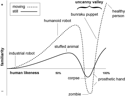
Longtime readers may recall a post that the since-deceased Krafty wrote on the topic of the Uncanny Valley:

Perhaps, at the time, you marveled at the splendid oddness of this shiny new meme. Maybe you studied the graph carefully enough to realize the ‘prosthetic hand’ is cleverly mapped to TWO data points, one on the ‘moving’ path and one on the ‘still’ path. Or perhaps you just moved on to the next post, which was probably something about robots.

Nowadays, you can’t swing a dead cat without it slipping from your grip and landing in the Uncanny Valley— what was once a private conceit has grown into an inescapable meme. Last week, a friend forwarded me two links to read… and it turned out that BOTH articles included off-hand references to the Uncanny Valley:

First, it cropped up in an investigative article by Willy Staley entitled, ‘A Conspiracy of Hogs: The McRib as Arbitrage‘. Staley invokes it to describe the disturbing physical form of the McDonalds McRib sandwich, in this compelling rant about the cloaked and sinister market forces that account for the otherwise-unexplainable appearances and disappearances of this perennial big ribby thing: “Each time it rolls out nationwide, people must again consider this strange and elusive product, whose unique form sets it deep in the Uncanny Valley—and exactly why its existence is so fleeting.”

I enjoyed Staley’s short history of the product, and shared in his puzzlement about why the thing looks so grotesque when McDonalds has clearly harnessed the ability to mold food into whatever kind of non-offensive spheres they want (see McNuggets). Also, a weird ancestral memory stirred in me while reading this. A memory of a book called Encyclopedia Brown’s Book Of Weird And Wonderful Facts that an aunt gave me for one of the birthdays in my nerdsome younger years. The book was only loosely affiliated with the crime-solving boy sleuth and basically just contained a long list of odd-ball factoids.

One such factoid that stuck in my memory was a tidbit about a local Burger King franchise somewhere in Massachusetts who got in trouble for putting a promotional display outside his restaurant that showed Ronald McDonald in a coffin with a tagline: They got me in the McRibs. The point was that children were distressed by the dead clown. Just as seems to happen to the local Republican Committee every time around Halloween leading up to an election year, a co-mingled spirit of partisanship and gore got the better of the Burger King franchisee’s common sense.

The second link my friend sent me is called The Social Graph Is Neither, and the author’s voice seemed oddly familiar from the outset… sure enough, by the end, I realized that it’s written by the irritatingly talented Idlewords guy, Maciej Ceglowski. Ceglowski evokes our friend, The Uncanny Valley, in a somewhat more trenchant way to describe creepiness of social networks and their efforts to map and mimic social convention. “Asking computer nerds to design social software,” he writes a little later, “is a little bit like hiring a Mormon bartender.” Then, he actually manages to work the Mormon bartender joke back into the article a bit later— that was good.

Anyway, I suppose you could tabulate all the Uncanny Valley references made since this blog started and plot them according to an X and Y criteria in order to make a Meta/Uber Valley of Uncanny Valleys, and the result would probably be something nerdy that would allow you to make the Mormon bartender joke yet one more time.

Hello, Birdie pt. 2

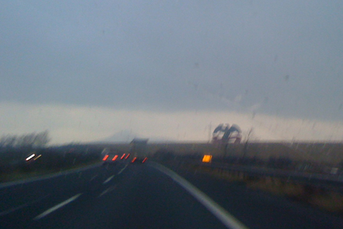
This past weekend, we threw the kid in the back seat and drove to Berlin through some really bad weather. On the D8 highway that connects Czech Republic to Germany, there’s a big Mattoni sign that looms over the highway. I’ve always thought the sign is pretty cool looking, but I can only remember doing the drive in decent weather before. In the foreboding context of our Friday drive– low visibility, gathering clouds– I suddenly realized how much it looks like a giant prop from Schindler’s List or some other Nazi movie, ‘welcoming’ you to Germany:

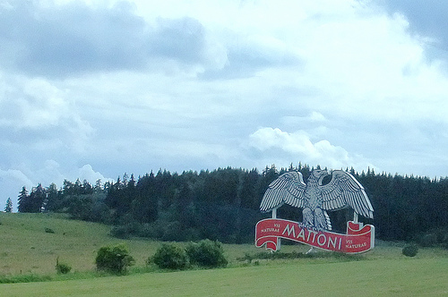
In normal weather, the sign has much more of a ‘hello, birdie’ quality:

(Photo: Flickr user Bharfot).

Unfortunate communications misstep that could have been avoided if they’d provisionally changed the Mattoni mascot to an anteater or a caterpillar for the Czech market. But I suppose the brand dilution wouldn’t have been worth it.

The choice of title for this post is sort of an homage to my favorite-ever Roz Chast cartoon, which I’m desperately trying to find an image of online but without success. It appeared in a New Yorker issue rightaround when Prozac first hit the market, and the premise is basically: What if various historical figures had access to anti-depressants? There are four examples, and the last one shows a doped-up Edgar Allen Poe cheerfully looking over his shoulder and saying, ‘Hello, birdie!’ to the raven.

See also: Hello, Birdie

Our Trip To Hell (Almost)

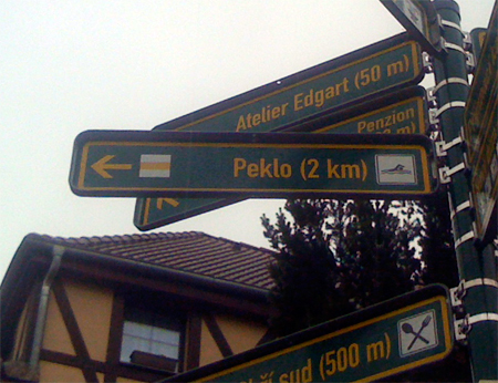
We spent this weekend in a nice village called Raspenava, in the north of Czech Republic, near the Polish border. As this sign indicates, Raspenava is only two kilometers from a village called Peklo, which unambiguously means ‘hell’ in Czech. So there it is: the road to hell.

We actually considered going because there’s a swimming pool in Peklo– you can see the icon for swimming on the sign here. However, I worried that it might be the swimming-in-lake-of-fiery-torment version and decided not to take any chances. If the icon had been printed in red, that would have been a definite giveaway…

Lifestyles of the undead

One of my dissertation students turned in a nice paper on the role of graphic design in the health care industry, which was a good choice of topic. It also allowed  for a brief and compelling glimpse into the history of anatomical drawing in the 16th and 17th centuries, a genre that manages to be awesomely whimsical and morbidly realistic by turns. Some of this stuff I’d run across before (usually in the context of samples of copperplate engraving), other examples were totally new to me.

These are culled from both her dissertation and my design history lectures:

Juan Valverde de Amusco, Anatomia Del Corpo Humano. A cadaver gallantly cuts off his own skin to show us the musculature underneath. The anatomical artists of this period liked to show their subjects engaged in goofy, fanciful activities in order to demonstrate a particular angle or aspect of the body.

Andreas Vesalius, De Humani Corporis Fabrica. A great spread, in which the skeleton on the left appears to mull over human mortality while the one on the right seems to be having a full-blown weeping fit. It’s a wonder nobody has yet produced a modern satire/update of this where skeletons are shown in various poses of hipster malaise, tapping on their iPads and naming their children Atticus and Rimbaud.

My favorite from De Humani Corporis Fabrica. One annotation I found claimed that this pose references an expression that saints and Jesus were often shown in, looking upwards to heaven. Whatever. With the spade and Idaho-like surroundings, it really looks to me like an exasperated  ‘Aaaagh, fer cryin’ out loud!‘ gesture. I just love it.

Ok, that was fun. Now for some more gruesome stuff…

Again from De Humani Corporis Fabrica. This time, our lanky friend has been hanged from a rope in order to reveal his esophagus. The thing that looks like a manta ray stuck on the wall to his right? Good news: that’s his abdominal diaphragm, fully removed from his body.

Govard Bidloo, Ontleding Des Menschelyken Lichaams. Hands with disconnected flowing tendons and feet with horrible pokey things stuck through them. I guess you couldn’t properly grasp anatomy without these flourishes? Let’s hope so…

William Hunter, Anatomy of the Human Gravid Uterus. Whoa.

Just to end the post on a more upbeat note…

Fritz Kahn, Der Mensch als Industrieplast (Man as the Industrial Palace). Poster from 1926 visualizing the human digestive system as a chemical factory. Unlike De Humani Corporis Fabrica, this one did get an awesome modern update treatment by Fernando Vicente:

Recent airport sightings

Some silly things spotted in various airports during my recent trip:

World’s tiniest baggage carousel (Vieques, Puerto Rico). Yes, I know I already posted this in the Clichés In Action post… but: I wish I could rent this thing out for children’s birthday parties. I like how the modest tiny wall partition in the middle allows the carousel to maintain a veneer of ‘technological magic’ while some guy secretly stands behind it and loads bags on.

Ghoulishly lifelike Carl Yastrzemski display (Boston, MA). I swear, after Chicago, Boston has to be the most goonily sports-obsessed city in the entire lower 48. You already have to drive through Ted Freakin’ Williams Tunnel just to get to the airport… and now a life-sized Yaz? My friend pointed out that when he flies to Boston, he can always spot his gate from a great distance just by the proliferation of sports hats visible in the waiting area.

Reassuring ‘Focus Safety’ sign (Vieques, Puerto Rico). There’s a lot to like here:

  1. The likelihood that the copy originally read ‘Focus On Safety’, before someone incrementally decided to turn the ‘On’ part into eyeballs.
  2. The fact that the Cape Air signature hawk has been placed inside the eyeball. This is kinda cool, but also creates the weirdly dissonant implication that  Cape Air is the cause of the danger that the poster is urging you to be vigilant against.
  3. Come to think of it, is the poster exhorting you the customer to exercise vigilance? Or is it reassuring you that the airline itself is always focusing on safety?
  4. Given that the entire Cape Air operation consists of about 4 people and 2 tiny airplanes- each of which is the size of a large van- they’d probably be better off not drawing your attention to the safety issue at all. Take it from someone with first hand experience: the less you think about your safety while flying Cape Air, the happier your experience is likely to be.

Assorted thoughts on Buy Nothing Day

  • Yesterday was a nice occasion to stop and reflect on all the things we’re grateful for in life. Unfortunately, it was also the nine year anniversary of Katherine Harris certifying George W. Bush as the winner of Florida’s electoral votes. Well, isn’t that a kick in the teeth. Happy ‘Angst-giving’.
  • Having a spiral staircase in your apartment seems like a really cool perk until you sprain your ankle playing basketball and are hobbling around on crutches. Then: not so perky. I know I mentioned this feature of our flat as a hazard to our kiddo already in the Obecni Dum post, but hurting my ankle really brings the point home. Every time I need to go upstairs to get something, I feel like I should have a team of sherpas with me.
  • I had plans for a classic food-laden, rowdy Thanksgiving with fellow expats, but wound up getting snowed in the entire day by a combination of bum ankle and rush project for work. Not the most festive of holidays. Sitting marooned in my arm chair, I got so hungry at one point that my infant son started to metamorphosize into a plump turkey before my eyes…
  • Finally, if you’re a designer and reading this, you must read this glorious email flame war between designer and client. There’s nothing quite like mocking a would-be client through libelous pie charts (hat tip: reader KF).

Unsettling info graphics of the day

Patent diagrams by Donald Spector from 1988 and 1999 respectively:

The top one is for an inflatable doll that expands when taken out of its test tube. The bottom one is for something called the Mommy Box that provided a ‘soothing’ video link to mother for distressed babies. These diagrams make a lot more sense in context, of course, but with all the mimicry going on (baby <> doll, real mom <> video mom), it’s not surprising that the initial effect is highly disconcerting.

(Via Thingamababy).

More bogus/silly info graphics here. More on unintended consequences of creepy robot doubling here.

Fun with info graphics

I’m currently designing a 200+ page book for an industrial developer in the Czech Republic and have so far had to design about 8 different maps of Europe- including roadways, ancient trade routes, a Moravian Pass and something called ‘The Blue Banana’- for the project. All this diagramming is about as enlivening as putting on chain-mail and drinking from a bucket of sand, so it’s fun to recall favorite silly info graphics as a counterpoint:

nychart

This was drawn in 1967 by rabid Velvet Underground fan Jonathan Richman (yes, he of the Modern Lovers) and published in the Boston music magazine Vibrations. Note the ‘made-it line’ running across the diagram– only VU and (mysteriously) the Who join the ‘god’-like Beatles in making the grade, whereas Hendrix, Jefferson Airplane and the entire sub-genre of art rock fall well short and crater into obscurity.

Then, on a more blatantly farcical note, there’s this pie chart that I love:

piechart

Update: Reader JF submits this one for consideration…

pac_chart