
On Tuesday, I took a train to Prague to personally chaperone my final proposal for the Jewish Museum identity redesign to the museum administrators. My proposal did not win. In fact, I got the phone call from the museum’s PR department while I was still on the train back to Berlin the next day.
I don’t know much about the selection process other than that there was a committee of 17 doing the voting on five proposals, and that one of the other four was apparently selected (I’ll be curious to see what this looks like when it’s formally announced in a few months, presumably). In any case, it was an honor to partake in such an interesting project, and I’m happy with the proposal I came up with…
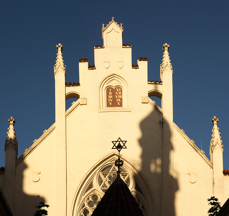
Logo
![]()
Form is based on the top of the Maisel Synagogue and is also meant to reference a Hanukkah Menorah
![]()
Czech version
![]()
Schematic showing proportions (this isn’t important to show…. I just like these)
Website

Homepage

Subpage
Wayfinding system:

These are three icons out of a total of seven– there was also a proposed system for signage. The actual proposal was 12 pages long, in fact– this is just a partial sampling.
Sorry to hear that. I think the ID came out really well. Just hope they did not choose something orange with ‘non-stop’. 😉
I really like it. Nice, clean logo design. The sample web page looks great. Sorry you didn’t get it.
If you ever start a semitic-themed spinoff of 40goingon28, I have a logo I can let go for cheap…
Yes! It’s going to be called “What! It’s 40goingon28! Just read it already!”
Might have looked a bit aggressive to them…hints of barbed wire? I know we should be supportive on the comments and all, and in my heart I am, but that’s really the first thing that came to mind. Sorry.